When was the last time you hired a company or purchased a product because of their logo?
You’re thinking probably never, right?
(Unless it’s McDonald’s maybe, because there is something magnetic in those golden arches, don’t you think? We’ll get to that in a second.)
You may not believe that branding can affect your purchasing decisions one bit. But that’s not the case. Often it’s already influenced our behavior, without us even knowing it.
Logos might seem innocent enough. Little icon. A nice font. But they are like little trojan horses. Not in the sneaky Greek warrior way, but in that they look harmless but are packed with potency.
A logo is a badge. A metaphor. A visual link between shapes, fonts and colors and your brand. What’s your brand? E V E R Y T H I N G. Its success is measured by how people FEEL about your business or product. Emotions, expectations, memories. Purchasing decisions, loyalty, recommendations.
Let’s explore this a little by breaking it down into 4 things.
- Look and feel
- Metaphors
- Mental shortcuts
- and Storytelling
Look and feel
Branding is a tool to help influence how people feel about your business. Your logo alone isn’t your brand. But it is a significant player. It’s the main identifier. A flagship. It may be the tip of the iceberg, but just like it’s frosty metaphorical cousin, it’s often the visual representation above water that most people will pay attention to.
Your logo can look and feel fun. Or secure. It can even bravely try to be a bit of both.
You probably don’t want to hire a fun law firm or financial advisor.
That said, maybe you do?
Look at the latest batch of financial institutions differentiating themselves from the old guard.

Monzo is about creating effortless banking that feels like magic.
Here’s what their designer Sam said about how they looked to represent magic and more in a banking logo:
“Magic is intelligent and beautiful and the brand identity is a reflection of these values. At Mondo’s core lie a series of tensions: human/technology, effortless/complex, trustworthy/delightful. I developed the new Mondo mark as an expression of these tensions. It aims to be strong, confident and trustworthy whilst remaining colorful, friendly and human.”
You could be thinking ‘codswallop’ but really, take a look at these other brands looking to make the same kind of shakes.


Digital banks Starling and Monese looking to differentiate.
Be honest. It’s not an old school banking vibe, is it? And that’s totally intentional. They’re a new breed. Their logos are designed to make you sense this.
It’s probably the color palette that’s most obvious. Color psychology plays a huge part in logo design. But color isn’t the only factor.
Metaphorical manipulation
The icon itself can stand for a wide range of values. Let’s take this logo for instance. It features an arrow. An arrow is a great choice for a political party because it can signify direction, progress, (Br)exits. All very logical metaphors. The use of any image will lead you to believe that the business is associated with the same values. ‘Their logo features a smile, so I bet they’re nice to deal with.’ We’re programmed to accept this, even though we should know better.
But how about this for a subliminal visual cue?
Above: Brexit Party logo. Below: How it appears on a ballot paper.

The Brexit Party achieved a significant victory in the UK’s recent European elections, securing the most seats. Whilst this little logo probably can’t take all the credit, anyone that is familiar with nudge theory, or behavioral insights, will be shocked that such a visual cue was permitted.
Genius design, or a little too manipulative? Perhaps both.
Mental Shortcuts
Remember the pull from those golden arches we mentioned at the start? Maybe you don’t get it because McDonalds ain’t your McBag. Or you’re scared of clowns. No worries. How about Starbucks? Have you ever seen the famous green mermaid and associated word mark and thought, ‘do you know what, I could do with a coffee right now’?
There’s a reason for that and it’s possibly not because you were tired or thirsty. It’s a mental shortcut. Your brain makes the connection between that logo and how you previously felt. Maybe you felt relaxed. Maybe you felt socially connected. Maybe you felt hipster. (Although, Starbucks really isn’t hipster. Sorry.)
Many kids see the McDonalds logo and subliminally associate it with a time they had in the past that was fun. Parties, iPads, play areas, finger food (hopefully hand gel in-between), balloons and little toys. The big ‘M’ = fun. Not 100% chicken breast.
Storytelling
Scientists tell us that the human brain lights up when stories are being told. Nothing empowers a brand today quite like a good story. Your logo and website are a platform for storytelling. Our technologically connected world helps the word reach far and travel fast.
Establish values. Create talking points. Galvanize internal teams. All reasons why designers enjoy embedding symbolic meaning into their creations. To demonstrate, here are a few well-known logos with hidden gems that you might not have noticed.
Are you sitting comfortably?
Then let’s begin.
Cisco: Home is where the heart is for this network juggernaut. Not only are they named after the Californian city San Francisco, but their techy looking logo not only represents the iconic Golden Gate Bridge (oh, and an electromagnetic field apparently).
Toblerone: Keeping it real with the geographical roots, perhaps it’s not surprising to know that the mountain in the Toblerone logo represents the Matterhorn Mountain in Switzerland. But what if I told you there was a bear in the mountain? Way. Toblerone is made in Switzerland’s capital city, Bern. Bern’s coat of arms has featured a bear since the 13th century. Nice touch.
FedEx: Speaking of hidden symbols in negative spaces, this is a good example. It’s quite an obvious one that you might not have ever seen, but once you do you’ll never be able to un-see it. Luckily it’s nothing rude though, it’s just an arrow. Take a look between the E and the X. Oh… yeah! And as an arrow is a perfect symbol to represent a courier, we think it’s very smart indeed.
Amazon: We weren’t going to mention this one because chances are, you’ve seen it. But we couldn’t say A to B without including the A to Z that’s strategically communicated with this logo. It’s a smile, it’s an arrow, it’s selling everything from a-z, it’s got everything, really. Amazon’s logo used to be a river running through the letter A. It’s fair to say they’ve found a keeper now though.
Trip Advisor: Their logo is an owl because owls are associated with wisdom. Are owls really smart? Probably not. In fact, they may be significantly worse at problem-solving than birds like crows and parrots, who have much bigger brains and enjoy Sudoku. However, the reason these particular winged creatures are thought to be wise is that the owl was a symbol for Athena, goddess of wisdom and strategy. The little red and green eyes in the Trip Advisor logo indicates a traffic light kind of signal to signify whether you should go or not.
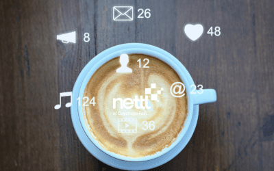
Nettl: We couldn’t leave you wondering about the thinking behind our very own Nettl logo. Legend has it, the vision came to us in a dream on the wings of wise old Greek owls.
Green represents lots of things that you’d want to be associated with. Health, nature, growth, money. Our pixelform is a digital nettle leaf. It blends nature with tech. The color of nature and the digital authenticity of a pixel.
However, we chose green because Hulk is our favorite Avenger. Who’s yours? No, wait, let us guess. Hmm, yep. Definitely getting an Iron Man vibe.
What’s your story?
We’ve used a lot of big brand examples here but don’t let that put you off. This stuff is just more important as a startup or SME.
And there’s no need to spend millions. All you need is a business with values, an idea of your target market, and a talented local studio to help you create this visually.


0 Comments